feel the way
logo, posters, and social media content for a house music dance event
visual identity for feel the way — a dance event built around house music and the people who live for it. the whole system started from one object - the disco ball - an icon inseparable from the history of house music and the culture that formed around it.
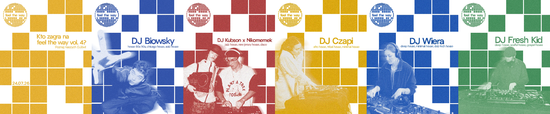
it shows up directly in the logo, and echoes throughout the rest of the system as the grid of squares that runs across posters and social posts — a flat, graphic translation of the same idea.
four saturated colors carry the energy of house music without overwhelming the system. bright and vibrant, they create a sense of freshness and energy while remaining highly visible. their classic, accessible palette reinforces the open and inclusive nature of the event.
the poster features a disco-floor-inspired composition built from geometric squares, visually echoing the reflections of a disco ball. rather than using all four colors at once, each piece picks one — letting the palette work as a family across the event's communication while keeping every single touchpoint clean and confident.