
unalike
concept presentation for a clothing brand built around quiet difference
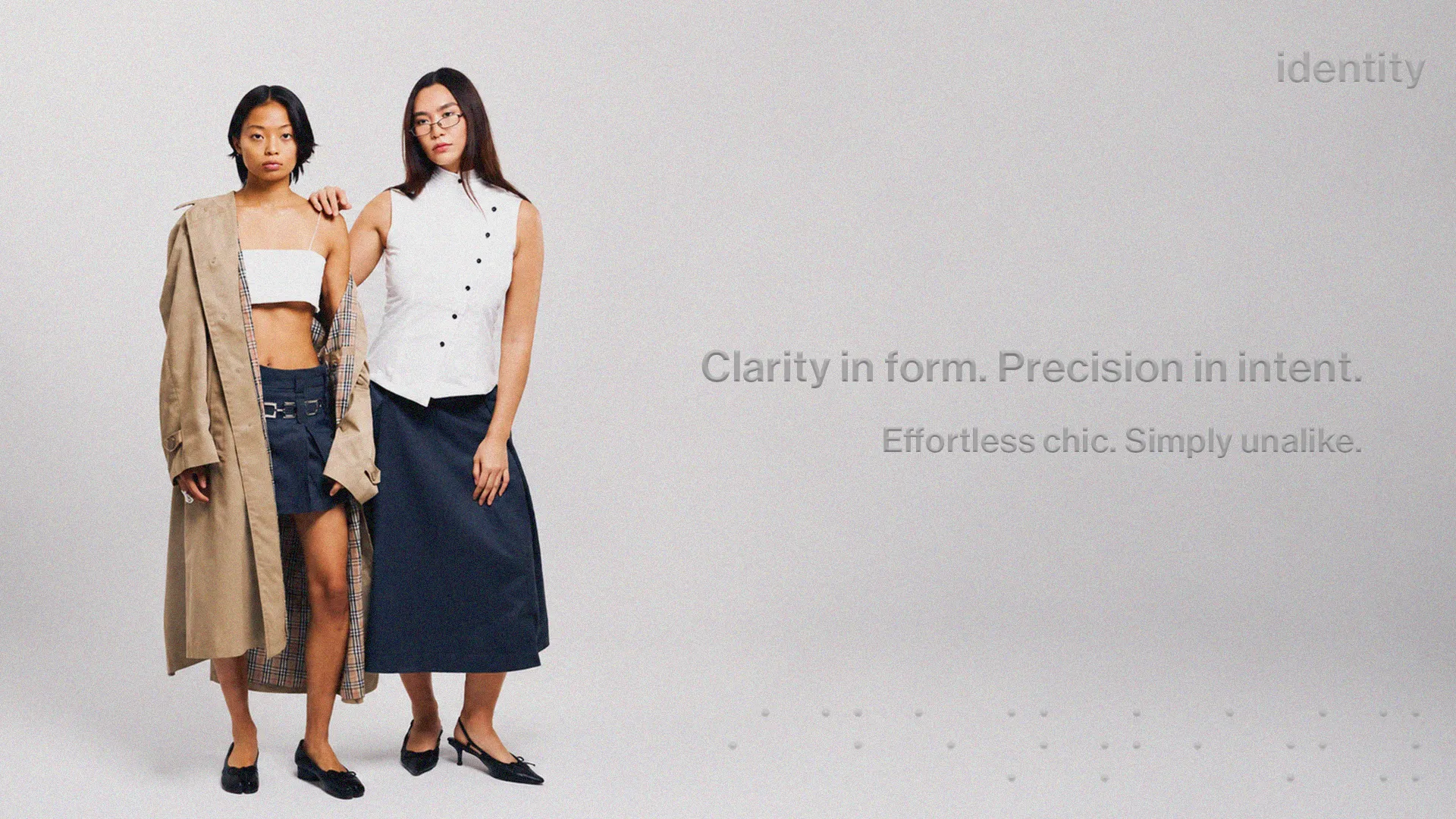
a presentation deck for unalike — a clothing brand expressing simplicity in an unalike way. built to introduce the brand to investors, trade shows, and retail buyers, the deck needed to do the talking before the founder did.
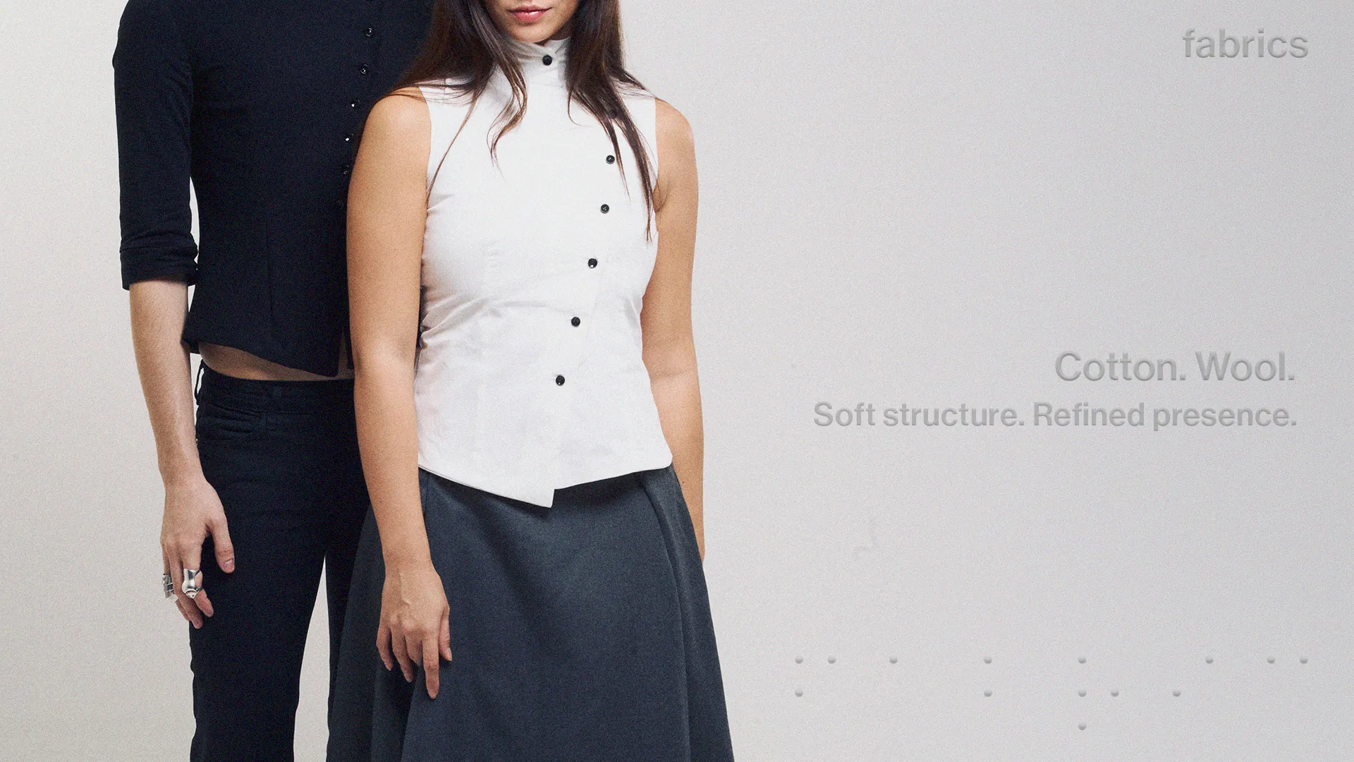
the design echoes what the brand stands for: simplicity, minimalism, a modern edge — no decoration where decoration would only get in the way.
braille runs through the layouts as a quiet visual signature — a nod to the idea that a brand can speak to more than one kind of person, and that communication isn't only what you see.
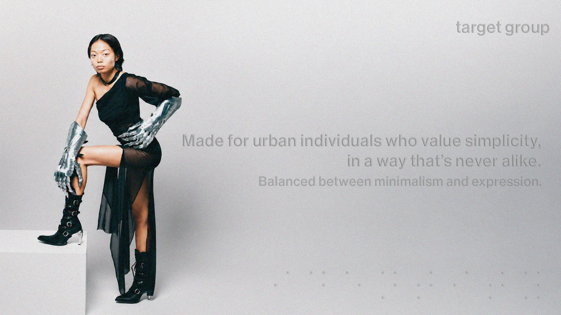
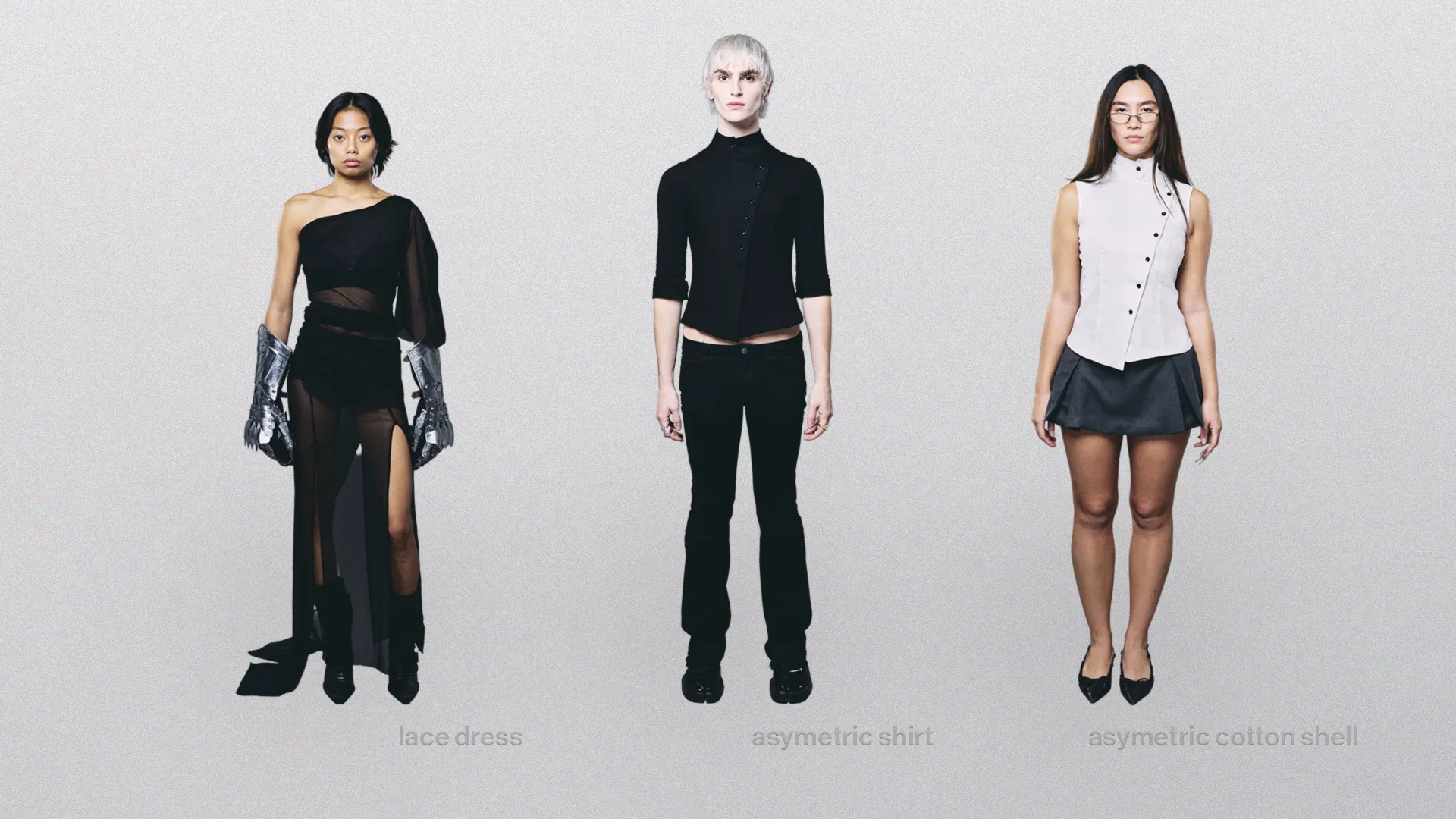
copy is kept deliberately short. the product photography carries the weight; the words only frame it, sketching the brand's intent without crowding the page.